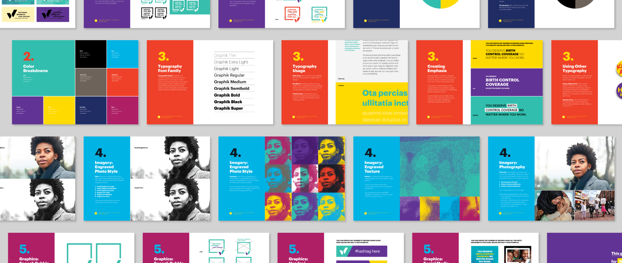
As the National Women’s Law Center has grown and become more visible, they needed a more action-oriented brand. Ready to aid them in changing the world, we got to work.
NWLC are advocates, experts, and lawyers who fight for gender justice, taking on issues that are central to the lives of women and girls.
WHAT WE DID
Logo design
Identity system development
Website, graphic & digital design
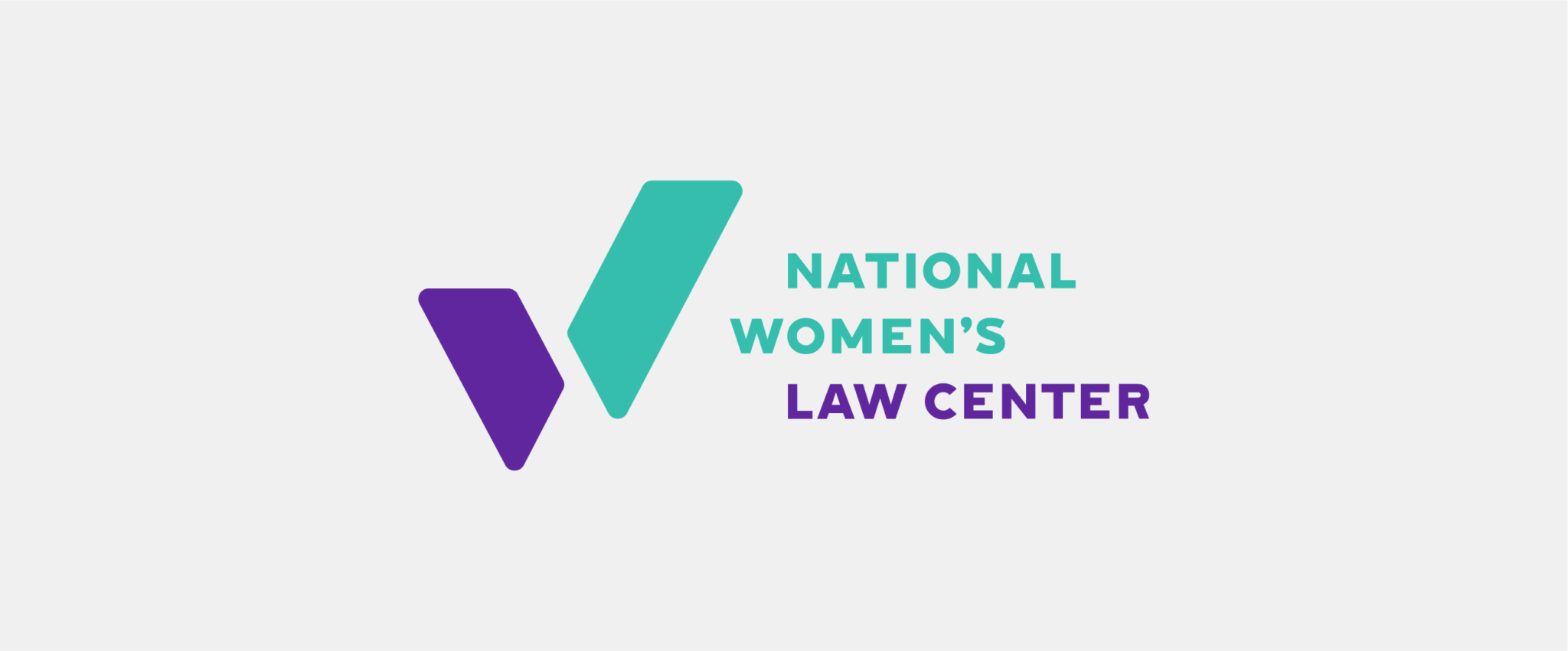
The logo is not only a W, but also a symbol—the check mark—for getting shit done.
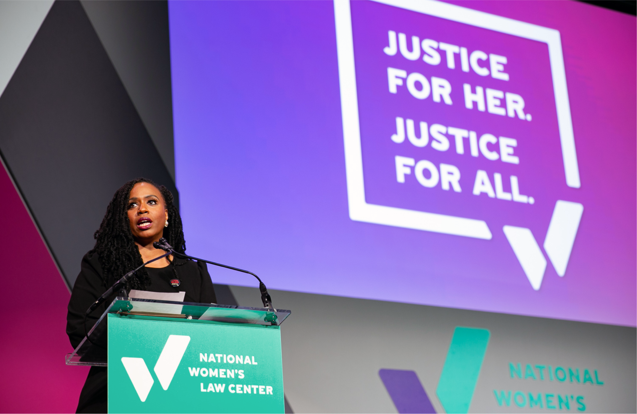
For decades National Women’s Law Center has been successfully working in Congress, in courtrooms, and in culture, advocating for women & girls. They wanted a mark that could also be a rallying cry for their work. We juxtaposed the simple mark with a modern twist on the engraved style of imagery like what is used on U.S. currency.
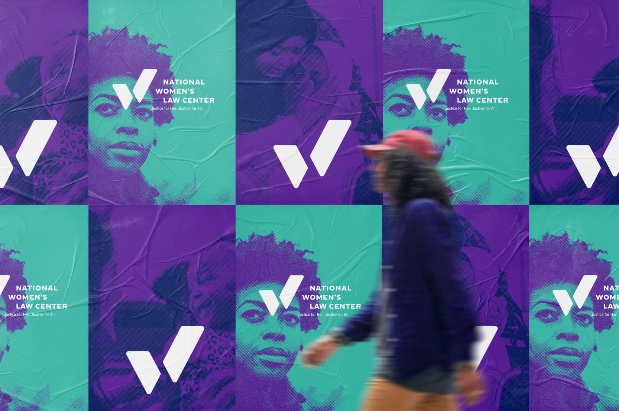





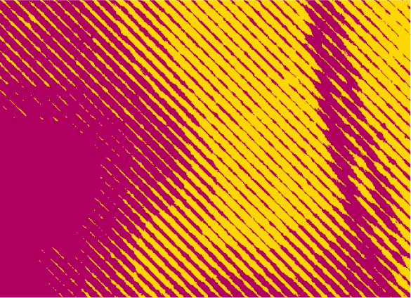
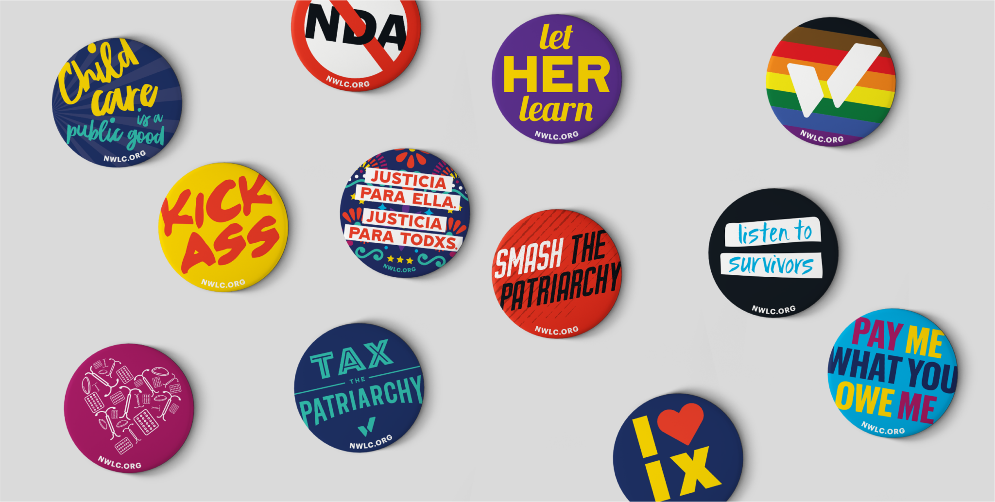
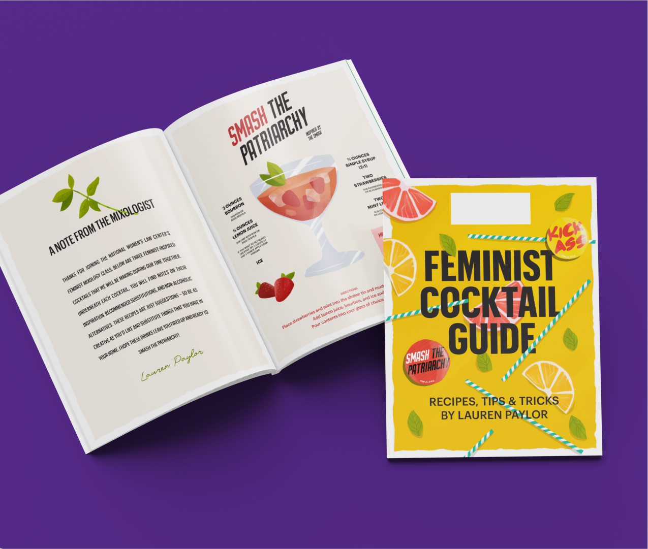
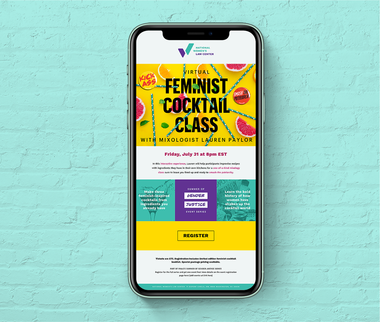
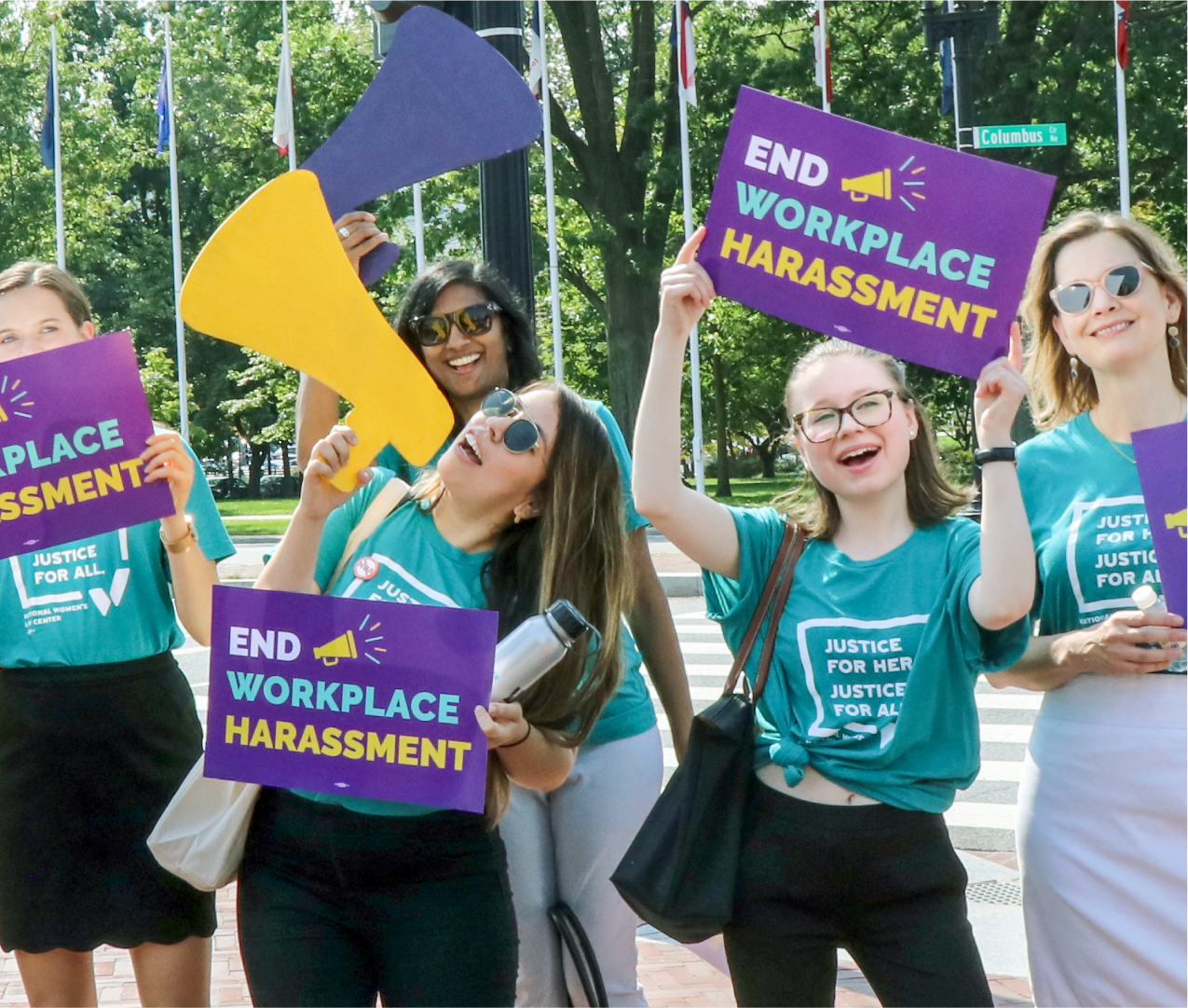
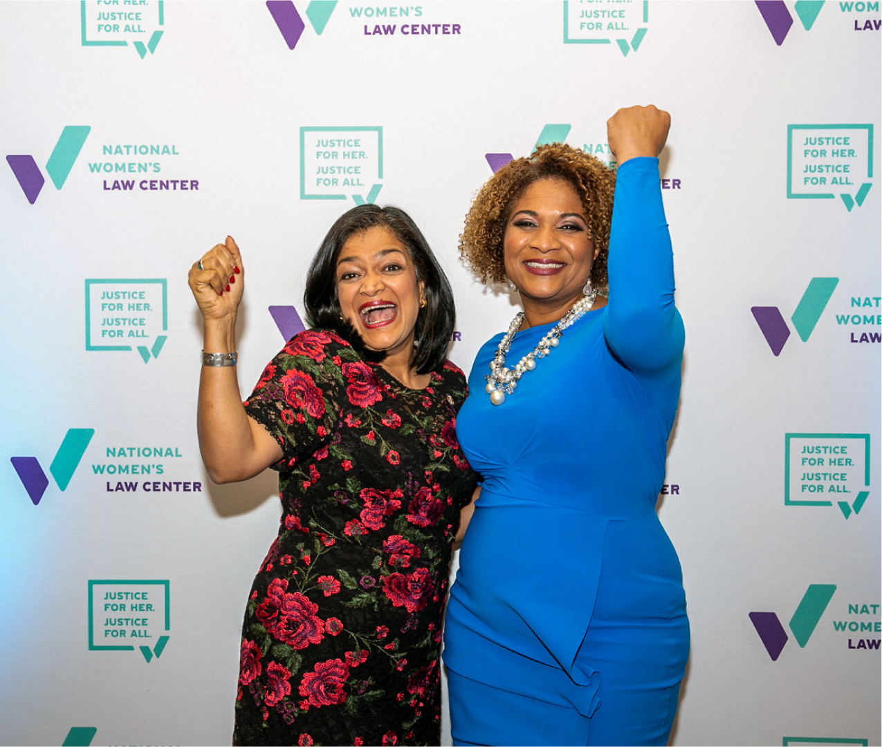
Identity materials are dynamic and bold through use of color, pattern, and scale.
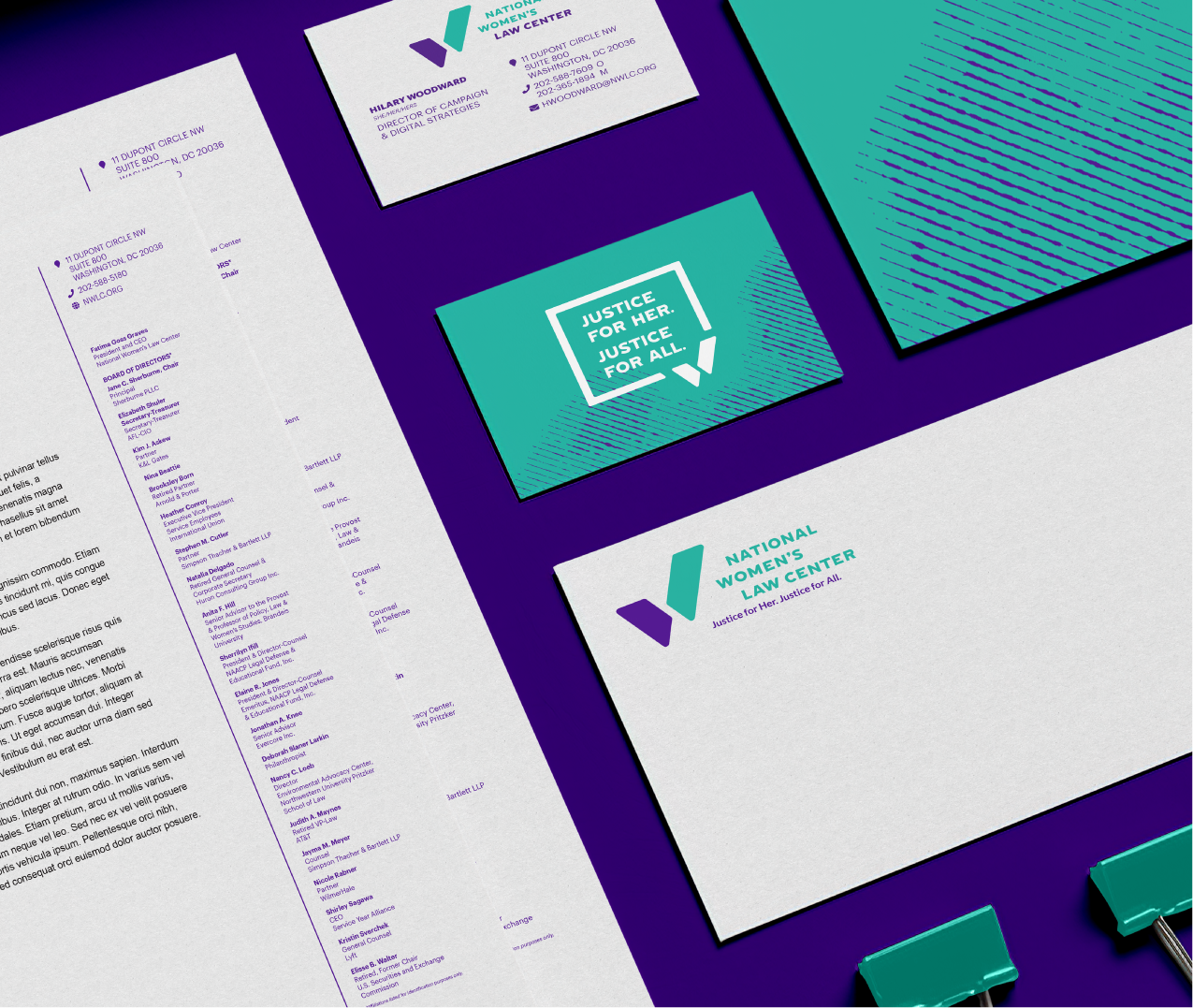
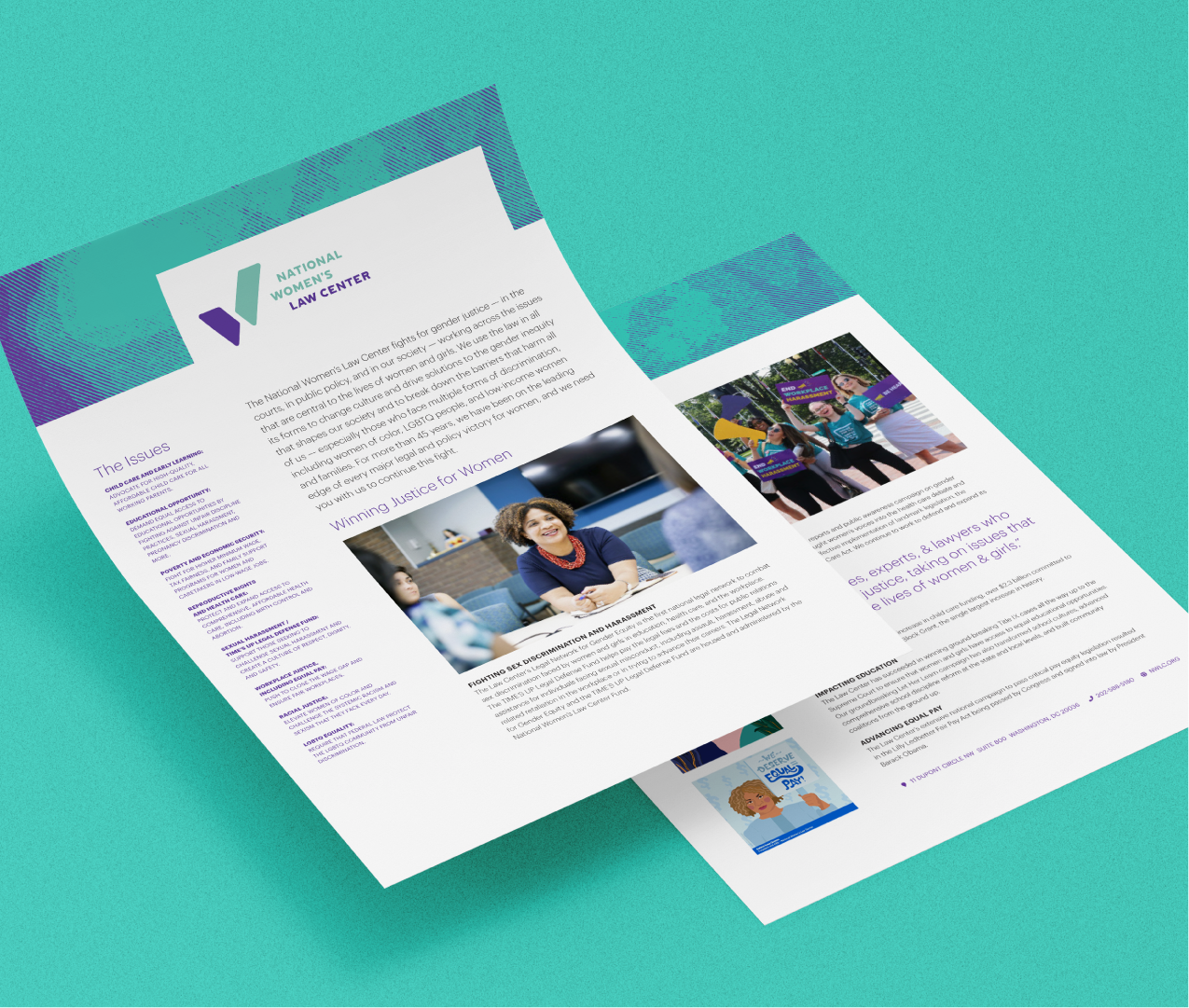
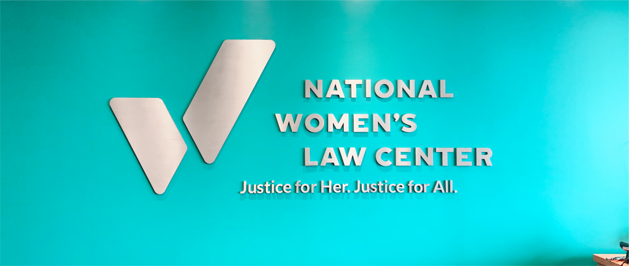
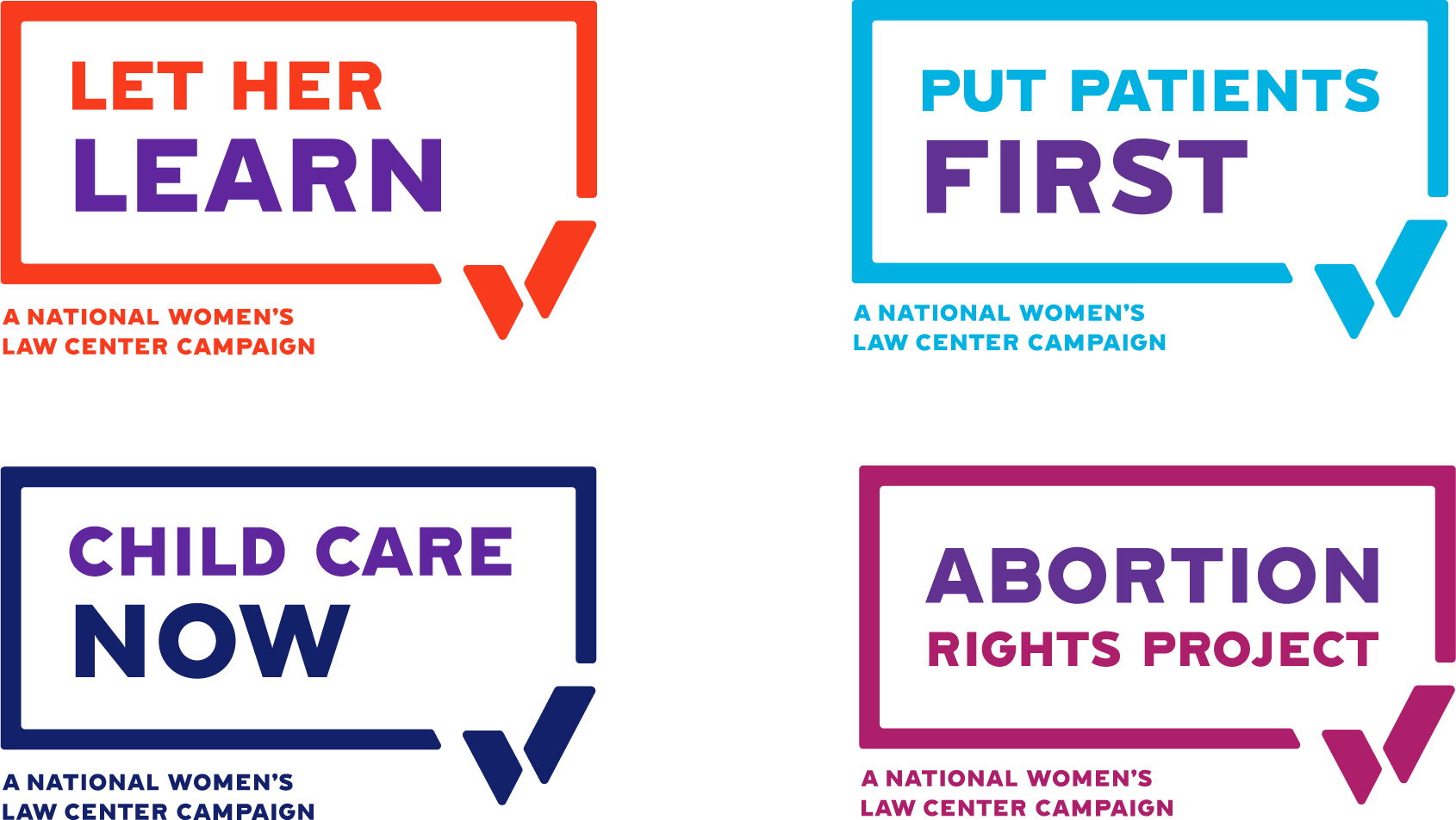
Programs were sub-branded with their own logo and defining color from the larger color palette.
NWLC works on a wide range of women’s issues—from education to healthcare to workplace justice. We gave each area
it’s own defining color and sub-brand that ties back to the overall NWLC umbrella.
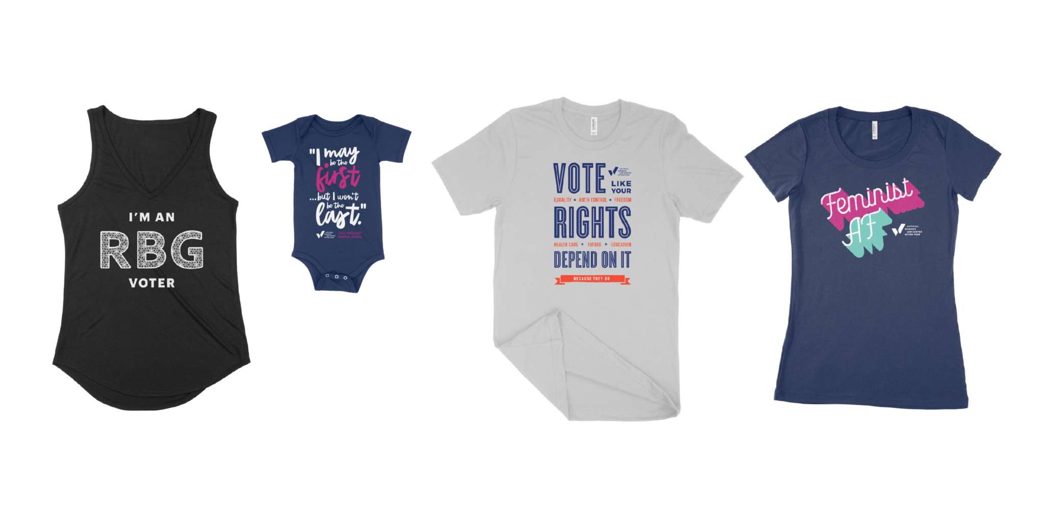
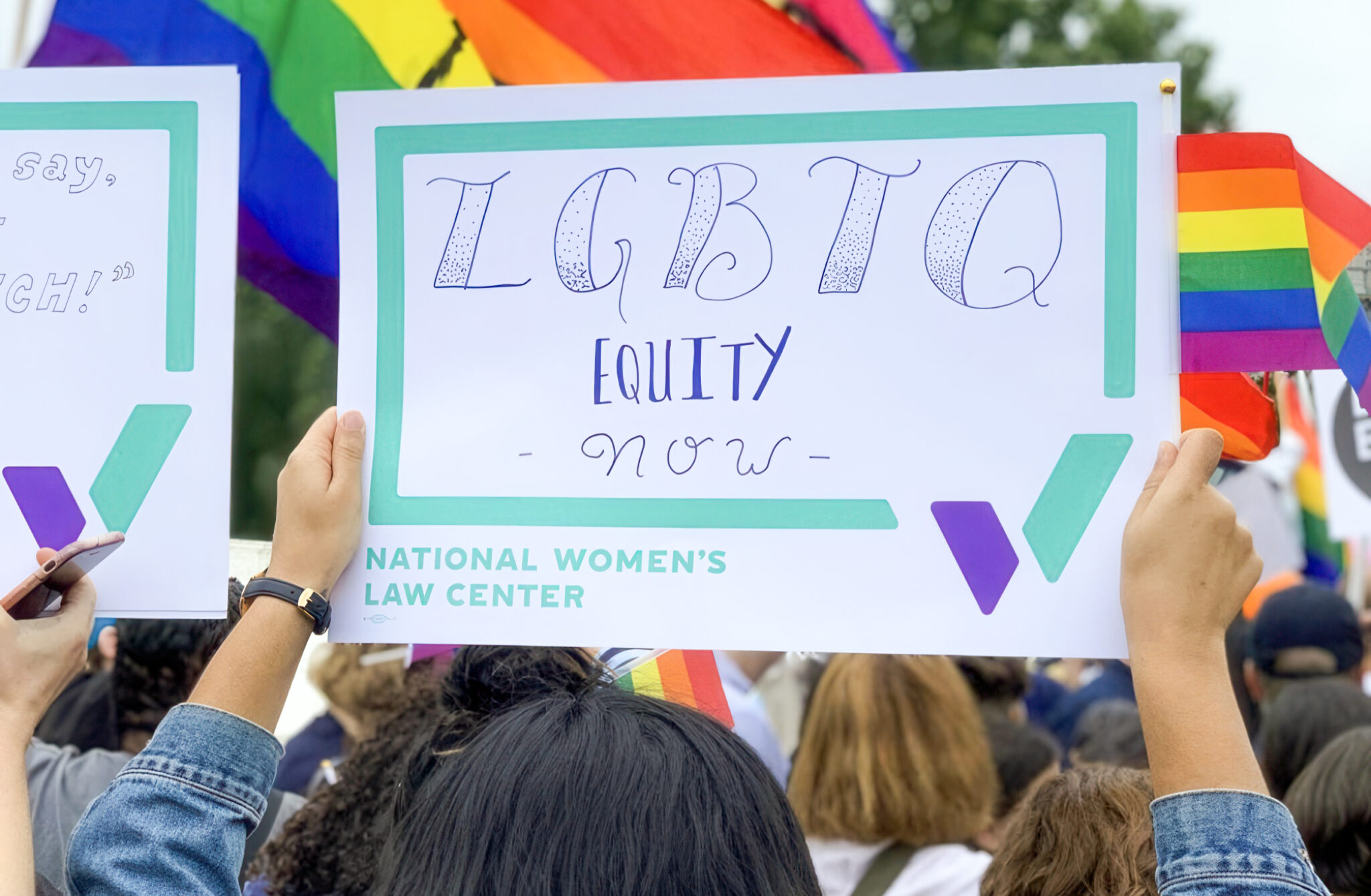
Non-profits rely on visibility in the community —whether it’s standing out on televised rallys or merchandise—to spread their message.
We decided that since NWLC was already known for their teal & purple, it made sense to keep that brand recognition. But we expanded their color palette to include 7 more colors. This allows more flexibility in their merchandise.

